CANADIENS TOWER 2 SIGNAGE
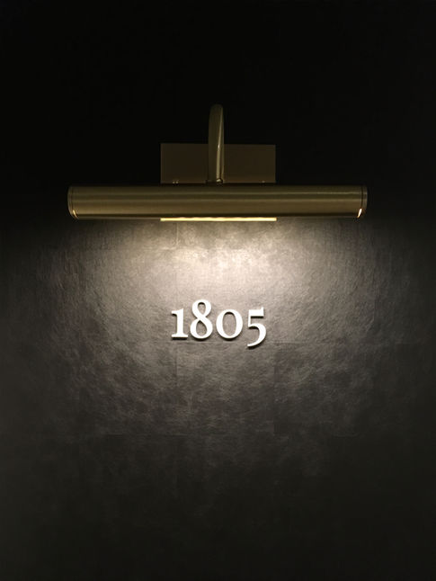
Based on the idea of two layers, the ice anchored to a stadium, the signage for the Tour des Canadiens 2 was designed for the public, common, and private spaces of the tower's 55 floors. It is composed of a distinct set of two serif typefaces. This is rare in signage, since it requires increased attention to the details of installation and the fine calibration of the letter.
CLIENT :
Cadillac Fairview & Canderel
LOCATION :
Montréal, QC
YEAR :
AREA:
2018
N/A
DISCIPLINE :
DESIGN GRAPHIQUE
PHOTO/3D :
Lorelei L'Affeter / Emilie Gadel

This distinctive feature was enhanced by the choice of the second typography, which included ligatures, which linked the letters together into a single glyph. Pictograms were born from these fonts: the letters dismembered and recomposed into images reinforced the uniqueness of reading.
The signage also includes the lighting fixtures, custom-made to reflect the tower's Art Deco-Reworked theme. It reads like a newspaper page floating on the walls, since each letter thickness is the same color as the wall on which it is placed.


